How to get more from combine yield maps
 (4) A smoothed yield map can be used to generate a variable seed plan
 It is 20 years since the first yield maps were generated by combines, allowing farmers for the first time to identify which areas of fields were failing to deliver the goods.
Two decades on and many growers are still not seeing the full benefits of this information.
It can be used to create variable seed zones to even up plant populations, calculate P and K offtakes for more precise fertiliser applications and much more.
However, Agrovista’s head of precision services, Lewis McKerrow believes many growers are using yield maps to calculate their cost of production.
See also: Four growers share their experiences of controlled traffic farming
“But this data can tell you much more. It can give you a true reflection of what is happening in the field,” he explains.
Highlight problems
For example, maps can highlight particular problems that need further investigation such as poor drainage.
They can also identify unproductive areas, which if taken out of production will raise field averages and save on inputs.
One grower who is making his combine yield maps work hard is North Yorkshire-based Graham Potter, who farms 195ha.
Targetted pellet use
This year, he is planning to use yield maps and overlay them with his soil conductivity data and the first N-sensor scan of biomass in the autumn to highlight areas being grazed by slugs.
“Pellets will then be targeted at high slug areas rather than being blanket applied cross the field.
“This approach cuts down on pellet use, which also has an environmental benefit,” he says.
GateKeeper
Mr Potter is also looking to try the GateKeeper tool that uses yield maps to produce a variable triple superphosphate (TSP) application map, based on offtake.
“It looks at the yields and tells you how much TSP to put on. I’m going to see if it works and compare it with my current Soyl system.”
He is also going to try the muriate of potash option.
However, he believes caution is needed when interpreting the maps, as there could be another problem such as flooding, rabbits or slugs, holding back yields.
Soil compaction
He is also using his yield maps to identify area of soil compaction. “They can appear as low yielding lines that correspond with the tramlines. Then you know you have to go in with the sub-soiler.”
Mr Potter is trialling a variable depth sub-soiler this coming autumn.
The ultimate use of yield data is to produce gross margin maps and Mr Potter has produced these using yield and input data – as all inputs are variably applied.
It helps him to decide whether to cut back on inputs in poorer performing areas.
“This year we had areas where oilseed rape failed to establish and I have not spent anymore on them.”
Finally, combine maps are valuable when running trials on a product. For example, when doing a half field comparison of a nutrient supplement or other product, it allows growers to compare yield with untreated parts, he explains.
Getting started
Using yield maps needn’t be complicated, as Lewis McKerrow of Agrovista explains.
Producing a smoothed yield map
Soil data is your first port of call when producing variable input maps, but not all farmers have this.
These growers can, however, use yields to produce seed maps, especially if a lower germination rate is the reason for the poorer yielding areas. Start by importing the raw yield data for the field in question.
“The first thing you will see from the drop-down menu is that combines generate lots of data such as swath width, engine load, fuel use and so on. But it is the yield mass that you are interested in,” says Mr McKerrow.
Once imported, your management software will try to match it to the boundary for an existing field. If it is a new field, you will need to set up a new entry.
Looking at the raw data, you will see some areas of very low yields and this could simply be where there was only half the header width cut or a turning point.
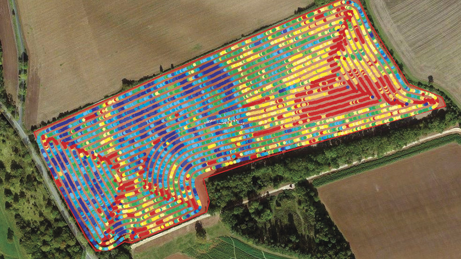
Example (1) Raw data from the combine
In the worked example (1), the field was cut in a circular pattern. This has resulted in red low yield areas at the turning points (diagonal lines), where there hasn’t been the crop flow.
First, look at the bell curve (graph) displaying the proportion of the field that falls into the different yield bands. Mr McKerrow advises removing the top and bottom outliers (the very high and low yields).
Then on the map, manually remove the red areas (half-header widths and turning points).
“It doesn’t matter if you are a little too aggressive as the software will smooth it out,” he advises.
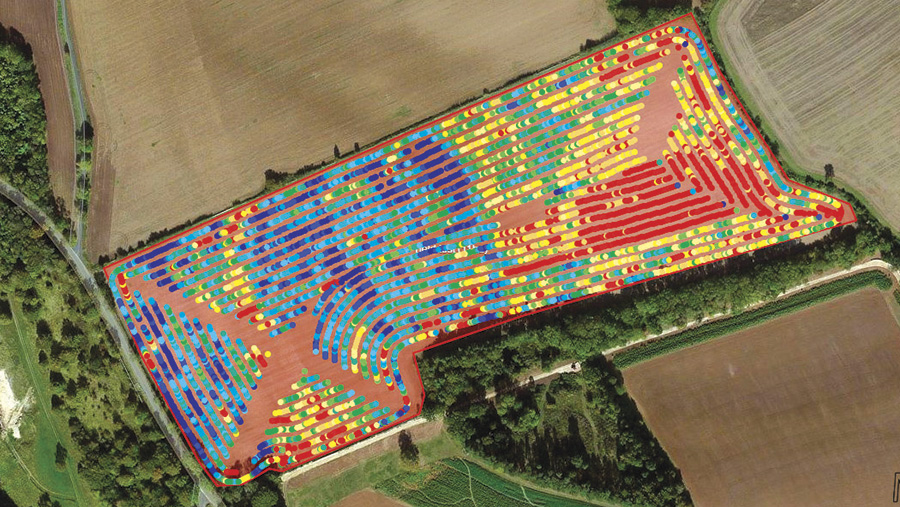
(2) Anomalous data has been removed to produce a smoothed map
Creating variable rate seed zones
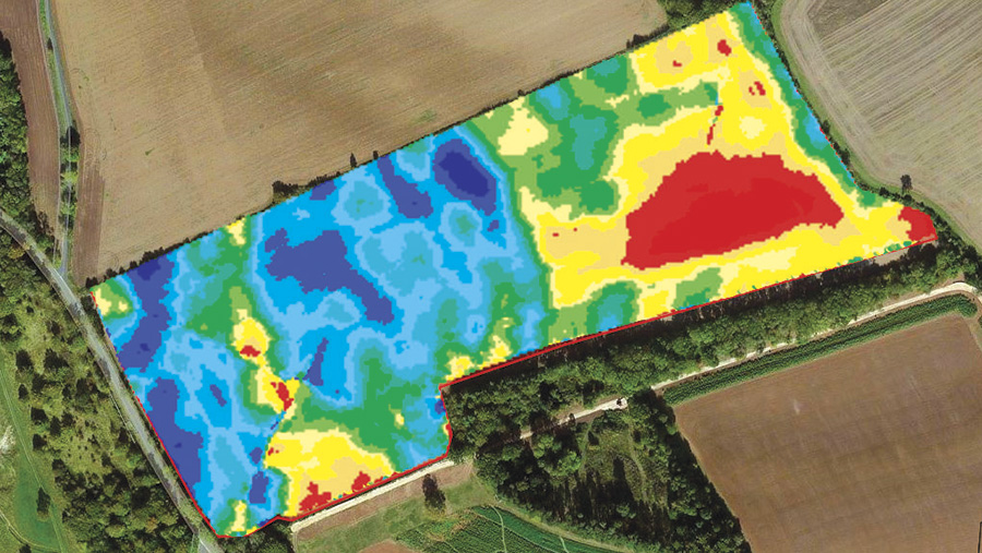
(3) A smoothed yield map post-edit
Once you are happy with the smoothed map (3), you can create the zones and the Agrovista Map It Pro system allows you to choose three to 13 zones. In the worked example (4), Mr McKerrow opted for five.
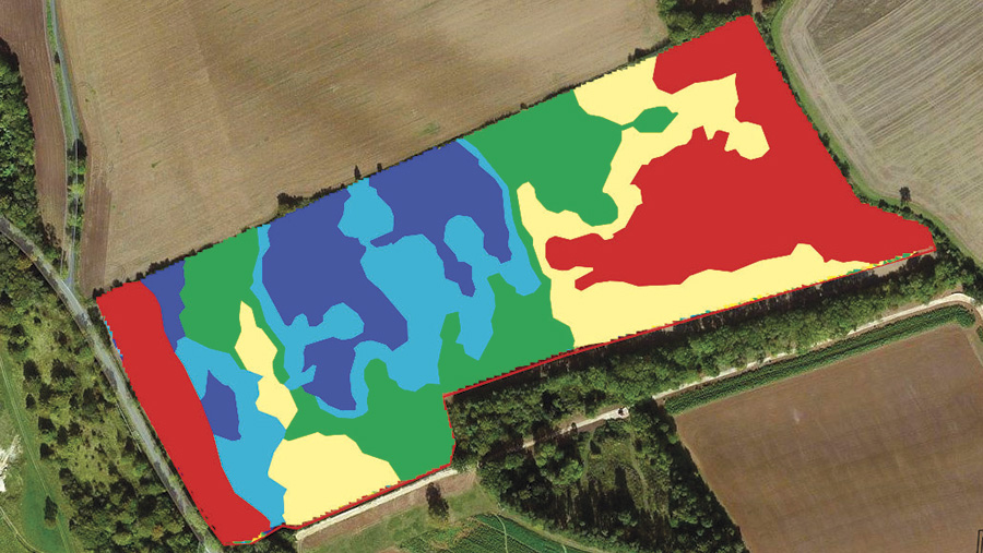
(4) A smoothed yield map can be used to generate a variable seed plan
Once the program has generated the zones, you can tweak them manually using local knowledge or add in a separate headland zone.
The next stage is to produce a plan by specifying the baseline seed rate, the program will calculate rates for the other zones such as +/-10%.
To check that it has worked, he advises doing population counts in the following spring. “For example, if numbers/sq m are 10% lower than anticipated, then you know to up rates in the following autumn.”
Creating P and K offtake maps
Another use is to calculate P and K offtakes, enabling a more precise matching of P and K applications to maintain soil indices.
The software uses RB209 Fertiliser Manual figures to calculate offtake. This is then used to produce a plan for the fertiliser spreader, to vary P and K fertiliser rates according to the zones, thus cutting unnecessary applications when blanket applying P and K.

