How data analytics can help identify marginal farmland
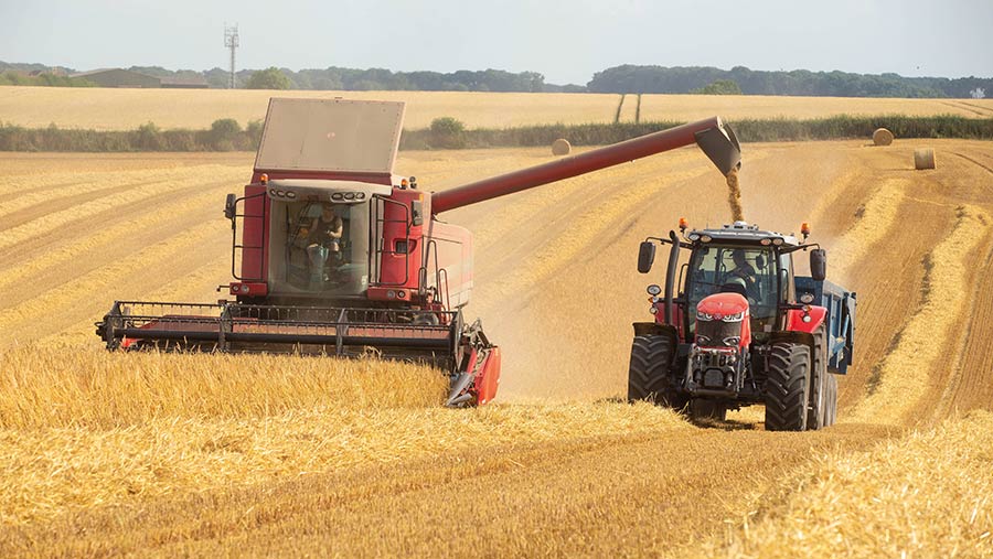 © Tim Scrivener
 The power of data analytics in improving decision making about future land use is being highlighted by a project at AHDB’s Strategic Farm East to use data to identify marginal land and land most suitable for environmental schemes.
The project, led by David Clarke, soils and farming systems technician at Niab, has used 10 years of yield data together with operation and input costs to create margin maps across 36 fields on E J Barker and Sons’ Lodge Farm near Stowmarket in Suffolk.
See also: Advice on clamping sugar beet for optimal harvest storage
“That equates to more than 1.4m data points, which is bigger than an Excel spreadsheet can take. The challenge is to make sense and implement management decisions from it.”
To do so, he created a five-step process as part of his PhD project.
1. Clean yield data
There will always be inconsistencies in yield data, whether it is from the header not cutting at full width, combine changing speed, or turning on headlands, Mr Clarke says.
“If those points are not removed either by the combine yield monitoring or whatever analytical software you use, it can cause quite drastic inconsistency when you analyse it afterwards, particularly on the headlands where there is a lot of turning.”
To combat this, he has used and developed methods to remove data generated from:
- Very slow or high combine speeds
- Where the combine has changed direction quickly and points before and after
- Where data is very different from neighbouring data (helps remove reduced header width cuts)
Yields can also be calibrated against on-farm measured weighbridge or weigh cell data and corrected accordingly, so when margin data is added there isn’t an overestimation or underestimation from the field, he says.
The cleaned yield maps typically have quite a lot of missed data points on headlands, he notes. “But it should leave enough accurate data from the headlands, as in this case, the Barkers go round the headlands two or three times while opening up the field.”
2. Apply an economic cost to each data point
While cleaned yield data can start to identify areas of high or poor performance it is hard to attribute that directly to economic performance. “Our next step was to give each point an actual margin.
“Brian Barker has very accurate records for each of his fields, so we can calculate either a gross or net margin for each yield map point by multiplying the yield by the grain price minus the total costs to give the net margin.”
In Mr Barker’s case, this was relatively straightforward, as inputs were standard across fields. But it would be more complicated with variable inputs.
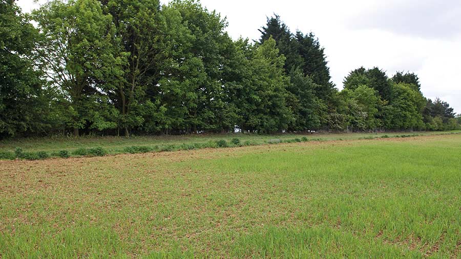
© Tim Scrivener
3. Identify areas of the field that perform the same each year
Once net margins have been calculated, a statistical method called clustering can be used to identify areas of fields that perform the same each year, he explains.
It compares each point in the field over the years to identify ones that fluctuate in a similar pattern over time – for example, those that are always high yielding or low yielding.
These can then be used to create a cluster map of the field, with similarly performing areas each year highlighted.
“You can then start to look at what this means, for example comparing wheat yields and margins for each different area across the years.”
In the Shrubbery Field example (see graphic), five areas of different performance were found by this method with the green and blue area (cluster 3 and 4) in the centre of the field consistently the highest margin part of the field, with the orange area (cluster 1), which is next to an area of woodland, usually the poorest part of the field, he says.
“If you look at the average margin across the rotation, the blue and green areas are earning on average £780-£840/ha. However the orange cluster only averaged £240/ha between 2011 and 2015.”
Most of this area was taken out of production in 2019 and put into 0.9ha of pollen and nectar mix paying £451/ha – based on this, the analysis has provided the economic justification for taking this area out of production.
While, in this case, the data was used to justify a decision already made, the principle applies to future decision-making, he says.
“We can identify other poor performing clusters across the farm then compare with the cost of implementing a scheme including establishment and management costs and the total payment received by the scheme, to make decisions to be based on the economic returns from arable production compared with environmental options,” he explains.
Result of cluster analysis of Shrubbery Field by David Clarke

© Niab
Net margin (£/ha) for each cluster in Shrubbery Field |
|||||
|
Year (crop) |
Cluster 1 |
Cluster 2 |
Cluster 3 |
Cluster 4 |
Cluster 5 |
|
2011 (Winter wheat) |
417 |
206 |
617 |
551 |
504 |
|
2012 (Winter wheat) |
447 |
892 |
1171 |
1327 |
946 |
|
2013 (Winter oilseed rape) |
275 |
438 |
694 |
975 |
579 |
|
2014 (Winter wheat) |
181 |
428 |
592 |
634 |
519 |
|
2015 (Winter wheat) |
-103 |
41 |
264 |
294 |
139 |
|
2019 (Winter wheat) |
Removed |
712 |
950 |
881 |
736 |
|
2020 (Winter wheat) |
Removed |
417 |
1179 |
1206 |
910 |
|
Mean |
243 |
448 |
781 |
838 |
619 |
4. Use other data sources to further help decision-making
Other data sources can also be useful for when making decisions, particularly about future land use and entry into environmental stewardship. “For example, erosion risk mapping using topographic wetness and Lidar-elevation data can help identify areas potentially at risk from soil or water movement.
“This allows you to look for areas that are at high environmental risk, as well as underperforming and where they co-exist.”
5. Compare across fields as well as in-field
The analysis also allows fields across the farm to be compared, particularly where fields have been in the same cropping rotation, says Mr Clarke.
Single field analysis allows the poorest performing areas to be identified, but it’s unlikely that parts of every field will be removed from production. Across field analysis provides the opportunity to highlight the poorest performing parts of the farm as well as giving greater insight into where measures should be targeted, he explains.
What data do you need?
- Yield mapping (calibrated) – essential
- Field / crop level variable costs – essential
- Recorded field yield values – useful
- Non-spatially mapped crop info – useful
- Soil scans – bonus
- Satellite images – bonus
- Environmental risk maps – bonus
What tools are available to do this type of analysis?
While David Clarke’s analysis is bespoke to the project and uses advanced data cleaning and clusters, there are some digital tools that potentially could be used to identify marginal land in a similar way.
Farmplan’s Gatekeeper is one that can mirror closely Mr Clarke’s analysis. Yield maps can be pulled into the platform via API cloud connections for most major combine brands or transferred via USB. Anomalies can be removed through setting up a template, which can be run year-on-year, and corrected against weighbridge tickets, explains Adam Joslin, training services manager for Farmplan.
The platform’s crop management information can then be aligned with the yield maps to create either net or gross margin maps on a field basis, accounting for any variable rate applications.
But while yield maps can be aggregated over a number of years, as yet the margin maps cannot, Mr Joslin notes.
Hutchinson’s Omnia can also create cost of production maps, including operational costs, aligned with yield maps, while Frontier’s MySoyl can produce total crop income, gross and net margin maps both for single and across multiple years after inputting fixed, variable and crop sale values.
David Clarke was speaking during two AHDB webinars on how to identify marginal land